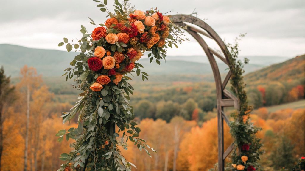

You’ve spent months planning your dream wedding, only to realize on the big day that your bridesmaids’ dresses clash with the table linens, the flowers look washed out in photos, and the venue feels more chaotic than cohesive. Unfortunately, 63% of brides admit to regretting their color scheme or decor choices—often because they underestimated the power of wedding color coordination.
Choosing a color palette and decorations isn’t just about picking your favorite hues. It’s about creating a harmonious, visually stunning experience that reflects your personality, enhances your venue, and wows your guests. Whether you’re planning an intimate elopement or a grand ballroom affair, this guide will show you how to select a cohesive color scheme, pair decorations with your palette, and avoid common pitfalls that can turn your dream day into a visual nightmare.
By the end, you’ll know how to design a color story that ties everything together, from bridesmaids’ dresses to table settings, and creates a memorable, Instagram-worthy celebration.
The Psychology of Wedding Colors: Why Your Palette Sets the Mood
Colors evoke emotions, tell stories, and create atmospheres. Studies show that 85% of wedding guests remember the color scheme long after the event. Your palette isn’t just a visual choice—it’s a tool to set the tone for your entire celebration.
What Your Wedding Colors Say About You
- Classic Whites and Ivories: Timeless, elegant, and pure. Perfect for traditional weddings.
- Soft Pastels (Blush, Sage, Lavender): Romantic, dreamy, and feminine. Ideal for garden or spring weddings.
- Jewel Tones (Emerald, Sapphire, Ruby): Luxurious, dramatic, and sophisticated. Great for winter or evening weddings.
- Earthy Neutrals (Taupe, Terracotta, Olive): Warm, natural, and organic. Perfect for rustic or outdoor weddings.
- Bright and Bold (Fuchsia, Cobalt, Mustard): Energetic, fun, and modern. Ideal for summer or destination weddings.
How Colors Affect Your Wedding Photos
- Light Colors: Reflect light, making spaces feel brighter and more open (great for daytime weddings).
- Dark Colors: Absorb light, creating moody, intimate atmospheres (ideal for evening receptions).
- Metallics (Gold, Silver, Rose Gold): Add glamour and depth but should be used as accents, not primary colors.
Pro Tip: Test your color palette in different lighting (natural, candlelight, LED) to ensure it looks stunning in photos.
Step 1: Choose Your Color Palette—The Foundation of Wedding Color Coordination
Selecting your wedding colors is the first and most critical step in creating a cohesive look. Here’s how to choose a palette that feels personal, timeless, and visually balanced.
Start with Inspiration
- Nature: Pull colors from a favorite season, flower, or landscape (e.g., autumn leaves, ocean blues).
- Art and Fashion: Look to paintings, runway trends, or interior design for unexpected combinations.
- Cultural or Family Influences: Incorporate heritage colors or meaningful family hues.
The Rule of Three (or Five)
A balanced color palette includes:
- 1 Dominant Color (60% of your scheme).
- 1–2 Secondary Colors (30%).
- 1–2 Accent Colors (10%) for pops of contrast.
Example Palettes:
- Romantic Garden: Blush (dominant) + Sage (secondary) + Gold (accent).
- Modern Minimalist: Ivory (dominant) + Charcoal (secondary) + Dusty Blue (accent).
- Boho Chic: Terracotta (dominant) + Cream (secondary) + Deep Green (accent).
Avoid These Common Mistakes
- Too Many Colors: Stick to 3–5 hues max to avoid visual chaos.
- Clashing Undertones: Warm and cool tones (e.g., mustard yellow + icy blue) can clash. Test swatches together in natural light.
- Trend Overload: Neon or overly saturated colors can feel dated quickly. Opt for muted or classic shades with trendy accents.
Pro Tip: Use a color wheel to find complementary, analogous, or triadic schemes that naturally harmonize.
Step 2: Pair Colors with Your Venue and Season
Your wedding colors should enhance your venue and season, not fight against them. Here’s how to create a cohesive look that feels intentional.
Match Colors to Your Venue
- Ballrooms and Hotels: Jewel tones and metallics add glamour to neutral spaces.
- Garden or Outdoor Weddings: Soft pastels or earthy tones complement natural backdrops.
- Industrial or Urban Spaces: Moody colors (navy, burgundy) or bright accents pop against raw textures.
- Beach Weddings: Aqua, sand, and coral reflect the coastal vibe.
Seasonal Color Guidelines
| Season | Recommended Palettes | Avoid |
|---|---|---|
| Spring | Blush + Sage + Ivory | Overly bright neons |
| Summer | Coral + Navy + Gold | Washed-out pastels |
| Autumn | Terracotta + Olive + Burnt Orange | Icy blues or silvers |
| Winter | Emerald + Burgundy + Silver | Overly warm oranges and yellows |
Pro Tip: Visit your venue at the same time of day as your wedding to see how light affects your color choices.
Step 3: Coordinate Decorations with Your Color Scheme
Once you’ve chosen your palette, it’s time to bring it to life with decorations. The key is balance and repetition—tying colors together across all elements.
Florals and Greenery
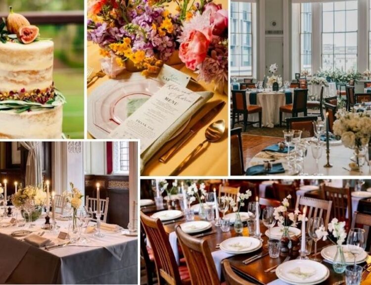
- Bouquets and Centerpieces: Use your dominant color for blooms and secondary colors in foliage or filler flowers.
- Example: Blush roses with sage eucalyptus and gold-dipped stems.
- Seasonal Blooms: Choose flowers that naturally thrive in your wedding season (e.g., peony in spring, dahlias in autumn).
- Non-Floral Alternatives: Dried flowers, pampas grass, or fruit (e.g., lemons for a summer wedding).
Table Settings and Linens
- Tablecloths: Neutral bases (ivory, gray) let colorful plates or napkins pop.
- Napkins and Place Settings: Fold napkins in your accent color or add a colored napkin ring.
- Plateware: Mix and match plates in complementary hues (e.g., navy plates with gold chargers).
Lighting and Ambiance
- Candles: Drip candles in your color scheme (e.g., burgundy taper candles).
- Fairy Lights: Warm white lights complement any palette; colored LEDs can clash.
- Lanterns and Hurricanes: Fill with flowers, sand, or colored glass that matches your theme.
Signage and Paper Goods
- Invitations and Programs: Use your palette for ink, envelopes, or wax seals.
- Seating Charts and Menus: Calligraphy in your accent color ties everything together.
- Confetti and Rice Alternatives: Dried petals or biodegradable confetti in your colors.
Pro Tip: Create a mood board (Pinterest or Canva) to visualize how colors and decorations work together before committing.
Step 4: Dress Your Wedding Party in Harmony
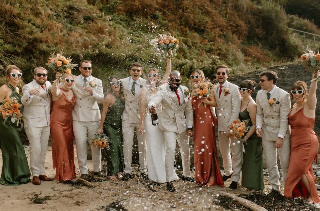
Your wedding party’s attire should complement your color scheme without looking matchy-matchy. Here’s how to coordinate outfits for a polished look.
Bridesmaids and Groomsmen
- Mix and Match: Let bridesmaids choose dresses in the same color family (e.g., various shades of blue).
- Fabric and Texture: Velvet, chiffon, or satin in the same hue can look completely different.
- Groomsmen Attire: Ties, pocket squares, or socks in your accent color tie the look together.
Flower Girls and Ring Bearers
- Mini Versions: Dress them in lighter or softer versions of your palette (e.g., pale pink for a blush wedding).
- Accessories: Ribbon wands, flower crowns, or bow ties in your colors add cohesion.
The Couple’s Attire
- Bride’s Dress: Ivory or white works with any palette, but colored sashes or embroidery can tie in your scheme.
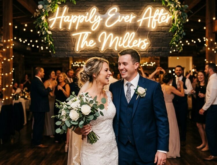
- Groom’s Suit: Navy, gray, or black suits pair with any color. Add a colored boutonnière or tie for a pop.
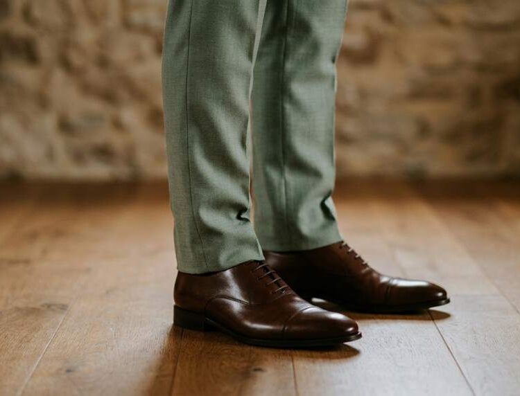
- Accessories: Shoes, cufflinks, or hairpieces in your accent color add subtle coordination.
Pro Tip: Take photos of your wedding party in their outfits against your venue’s backdrop to test how colors photograph together.
Step 5: Tie It All Together with Small Details
The magic of wedding color coordination lies in the small, intentional details that repeat your palette throughout the day.
Ceremony Decor
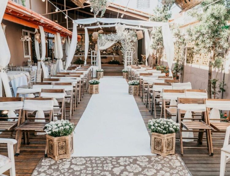
- Aisle Runner: Patterned or colored fabric that matches your scheme.
- Arbor or Altar Decor: Florals, drapes, or ribbons in your colors.
- Program Fans or Parasols: Double as favors in your palette.
Reception Touches
- Cake and Desserts: Frosting, sugar flowers, or cake stands in your colors.
- Bar Setup: Colored glassware, custom cocktails, or garnishes (e.g., blue curaçao drinks for a navy wedding).
- Dance Floor: Colored uplighting or a custom monogram in your hues.
Guest Experience
- Favors: Mini succulents, candles, or cookies packaged in your colors.
- Photo Booth Props: Signs, backdrops, or accessories that match your theme.
- Transportation: Ribbons on getaway cars or colored bus wraps for a grand exit.
Pro Tip: Assign one color to be the “thread” that appears in every element (e.g., gold in the invitations, centerpieces, and cake).
Step 6: Avoid Common Pitfalls—What to Watch Out For
Even the best-laid wedding decoration ideas can go awry. Here are the most common mistakes and how to avoid them:
Clashing Undertones
- Warm vs. Cool: Peach and mint might seem to work, but their undertones clash. Test swatches in natural light.
- Fix: Stick to all warm or all cool tones for harmony.
Overdoing Metallics
- Too Much Gold/Silver: One metallic accent is elegant; three looks tacky.
- Fix: Use one metallic (e.g., gold) and one matte color (e.g., navy) for balance.
Ignoring the Venue’s Existing Colors
- Clash with Carpets/Walls: A pink wedding in a green-carpeted ballroom can look jarring.
- Fix: Ask for venue photos and adjust your palette to complement the space.
Forgetting About Lighting
- Colors Look Different at Night: Pastels can wash out under LED lights; deep hues may look black.
- Fix: Test your palette under venue lighting or ask your photographer for advice.
Mismatched Textures
- Too Many Patterns: Floral tablecloths + striped napkins + polka-dot ribbons = visual chaos.
- Fix: Limit patterns to 1–2 elements (e.g., floral centerpieces + solid napkins).
Pro Tip: Hire a wedding stylist for a consultation if you’re unsure—it’s worth the investment to avoid costly mistakes.
Related Topics:
Reviews: Real Couples Who Nailed Their Wedding Color Coordination
Case Study 1: The Moody Autumn Wedding
Couple: Sarah and Mark, married in October.
Palette: Burgundy, Olive, and Gold.
Execution:
- Venue: A rustic barn with warm wood tones.
- Florals: Deep red dahlias, olive eucalyptus, and gold-dipped leaves.
- Bridesmaids: Mixed burgundy and olive dresses in different fabrics.
- Details: Gold flatware, burgundy napkins, and olive-green velvet table runners.
Result: “Our photos look like they’re from a magazine—rich, cohesive, and timeless.”
Case Study 2: The Minimalist Beach Wedding
Couple: Priya and Alex, married in Maui.
Palette: Ivory, Sand, and Aqua.
Execution:
- Venue: Barefoot beach ceremony with a driftwood arch.
- Decor: Ivory linens, sand-colored chairs, and aqua glass centerpieces.
- Attire: Priya wore ivory with aqua embroidery; Alex wore a sand-colored linen suit.
Result: “The colors mirrored the ocean and sand—it felt like nature designed it for us.”
Related Topics:
7 FAQs About Wedding Color Coordination
1. How do I choose a color palette that won’t look dated?
Stick to 1–2 classic colors (navy, blush, ivory) and add trendy accents (e.g., 2026’s “Viva Magenta”).
2. Can I mix metallics?
Yes, but limit to two (e.g., gold + copper or silver + rose gold). Avoid mixing warm and cool metallics.
3. How do I incorporate my partner’s favorite color if it clashes with mine?
Use it as an accent (e.g., his love of red in the groomsmen’s socks while keeping the rest neutral).
4. What’s the best way to test my color palette?
Order fabric swatches (Etsy or fabric stores) and photograph them in your venue’s lighting.
5. How can I make a small budget look luxurious with colors?
Use a neutral base (ivory, gray) and add one rich accent (emerald, burgundy) for drama.
6. Should my wedding colors match my season?
Not necessarily! Jewel tones can work in summer if paired with light neutrals. Pastels can shine in winter with metallic accents.
7. How do I coordinate colors with a non-traditional venue (e.g., brewery, museum)?
Pull colors from the venue’s existing decor (e.g., industrial brewery? Try navy + copper).
Conclusion: Your Blueprint for a Visually Stunning Wedding
Coordinating your wedding colors and decorations is more than just picking pretty hues. It’s about creating a cohesive, emotional experience that reflects your love story and wows your guests. By choosing a balanced palette, pairing colors with your venue, and tying details together, you’ll design a celebration that’s as beautiful as it is meaningful.
Your action plan:
- Define your color palette using the rule of three.
- Test colors in your venue’s lighting and season.
- Coordinate decorations from florals to table settings.
- Dress your wedding party in harmonious tones.
- Add small, intentional details that repeat your colors.
- Avoid common pitfalls like clashing undertones or overdoing metallics.
- Document your choices in a mood board or swatch book.
Your wedding colors will set the tone for your entire day. With these wedding decoration ideas and color coordination tips, you’re ready to create a celebration that’s as unforgettable as it is photogenic.
Ready to bring your vision to life? Start by choosing your dominant color—and let the magic unfold.